How strategic branding helped transform a family’s legacy into a modern jewellery identity inspired by Rajasthan’s architectural heritage.
In India’s jewellery industry, trust is often inherited long before it is advertised. Many of the country’s most respected jewellers are family-run businesses that have spent decades, sometimes generations, building their reputation one customer at a time. Their names become synonymous with quality, relationships and credibility. Yet when the next generation steps in with new ambitions, a different challenge begins to emerge. How do you introduce a modern brand without distancing yourself from the heritage that earned your customers’ trust in the first place?
This question was at the heart of our collaboration with Mohan Jewellers, a premium jewellery brand launched by the second generation of an established jewellery family from the Marwar region of Rajasthan. While the parent business had already built a strong local reputation, the new venture was created with a distinct purpose. It was designed for customers who appreciated contemporary jewellery but remained deeply connected to their cultural roots. These were buyers looking for elegance without excess, modernity without westernisation, and luxury without abandoning tradition.
For us at Fishyhue Studio, this was never going to be a project about designing another jewellery logo. It was an opportunity to create a brand identity that reflected both the aspirations of a new generation and the timeless character of Marwar itself. More importantly, it was a chance to demonstrate something we strongly believe: successful branding doesn’t begin with sketching ideas. It begins with understanding the business, the people behind it and the future they are trying to build.
Looking Beyond the Design Brief
One of the most common misconceptions about branding is that clients approach agencies knowing exactly what they need. In reality, they usually know the outcome they are looking for but not the process required to achieve it.
Like many business owners, the client initially approached us with what seemed like a straightforward requirement. They wanted a logo in both English and Hindi for their new jewellery brand. During our early conversations, however, it became clear that the real objective was much larger than creating a visual identity. They were introducing a completely new vertical under an already trusted family business, and the new brand needed to establish its own personality without losing its connection to that legacy.
Our discovery process always begins with conversations that extend far beyond colours, fonts or symbols. We discuss business goals, customer behaviour, future expansion plans and practical applications that may not even seem relevant at the beginning of a project. These discussions often uncover opportunities that clients themselves haven’t considered.
During one such conversation, we raised a question that would eventually influence the entire identity.
“What if, a few years from now, you decide to engrave your logo on your jewellery?”
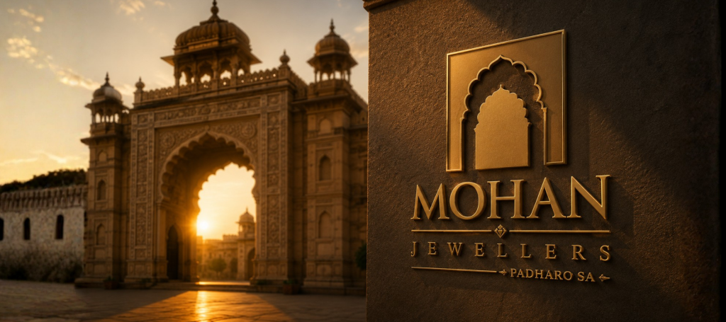
At that stage, engraving wasn’t part of the client’s requirements. It wasn’t even under consideration. But modern jewellery brands increasingly use subtle engravings on their products as a mark of authenticity and craftsmanship. If that possibility existed, even in the distant future, the logo needed to be designed with that application in mind from the very beginning.
The client immediately recognised the value of thinking ahead, and what started as a logo project evolved into a much broader branding exercise. That single discussion reinforced a philosophy we have followed for years: branding should solve tomorrow’s problems, not just today’s requirements.
Research Before Creativity
One of the biggest differences between decoration and branding lies in the amount of research that happens before the first concept is created.
Instead of opening Illustrator and experimenting with shapes, we spent nearly a week studying the region, its history and the audience the new brand wanted to serve. This phase included multiple discussions with the client, understanding their vision for the business, analysing customer expectations and exploring visual references deeply rooted in Marwar’s cultural identity.
When people think of Rajasthan, they often picture vibrant colours, royal palaces, intricate architecture and centuries of craftsmanship. It would have been easy to borrow one of these familiar elements and transform it into a decorative logo. However, that approach would only have produced another attractive symbol. Our objective was to find something that represented the business in a meaningful way.
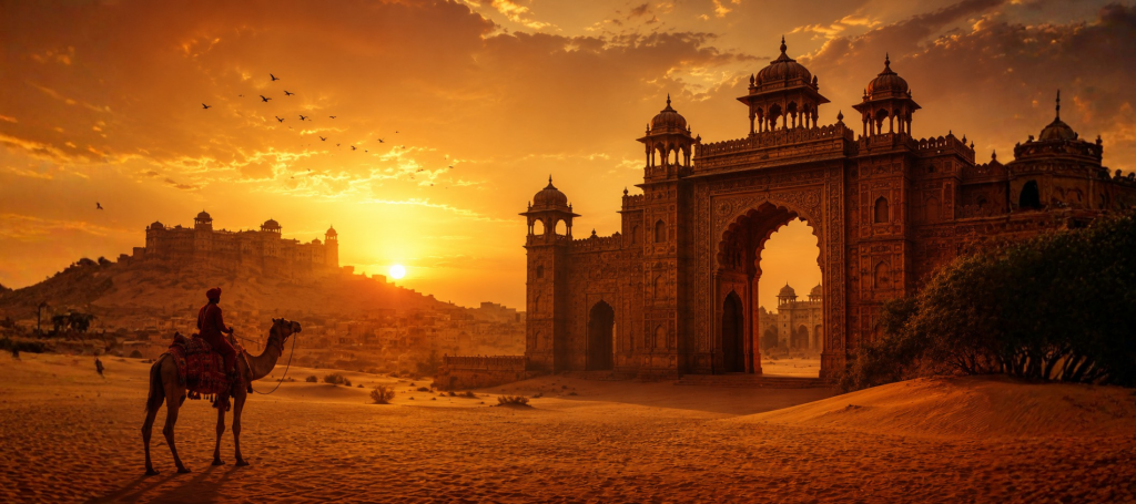
As we explored the architectural language of Marwar, one element repeatedly stood out—not because it was the most decorative, but because it carried a deeper emotional significance.
The grand entrance gateways of Rajasthan’s forts and palaces.
These entrances were never designed merely as architectural features. They represented hospitality, prestige and the transition from the ordinary world into a place of importance. Every visitor experienced the palace through its entrance first. It wasn’t simply a doorway; it was an invitation.
That idea resonated immediately with the brand’s chosen tagline: “Padharo Sa.”
For anyone familiar with Rajasthan, those words carry a warmth that extends beyond their literal meaning. While they translate to “Welcome,” they also reflect the region’s tradition of honouring guests with respect and generosity. Suddenly, the connection became obvious. Instead of creating a logo around jewellery itself, we could build an identity around the experience of being welcomed into a trusted family business.
The inspiration wasn’t a gemstone or a crown. It was a doorway.
Distilling Heritage into a Contemporary Symbol
Finding the right inspiration is only half the challenge. The next step is translating that inspiration into a form that works in the real world.
One mistake often seen in heritage-inspired branding is the temptation to reproduce historical details exactly as they appear. While these illustrations may look impressive, they rarely function well as modern brand identities. Intricate artwork becomes difficult to recognise at smaller sizes, loses clarity across different production methods and often feels more like an illustration than a logo.
Our objective wasn’t to recreate the architecture of Marwar. It was to capture its essence.
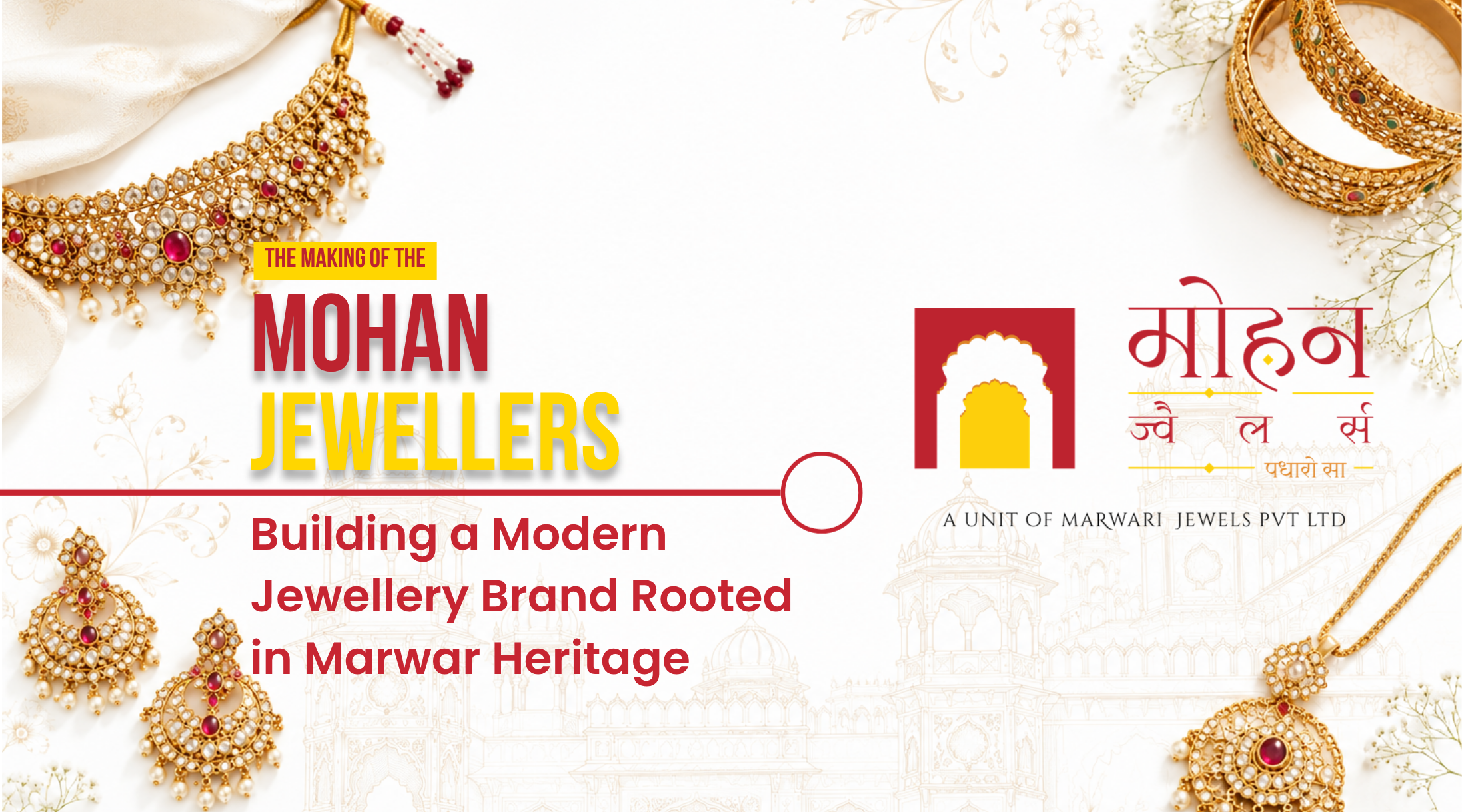
We carefully studied the proportions and geometry of traditional palace entrances before simplifying them into a clean, symmetrical mark that retained their recognisable character. Every unnecessary detail was removed until only the strongest visual idea remained. The final symbol was unmistakably inspired by Marwar, yet contemporary enough to represent a premium jewellery brand for years to come.
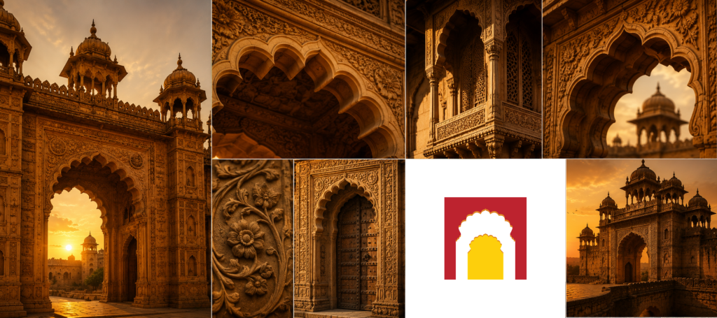
Symmetry played an equally important role throughout the process. Jewellery itself is associated with precision, craftsmanship and balance. A symmetrical symbol naturally reinforces those qualities while improving recognition and consistency across different applications. More importantly, it ensured the logo remained visually stable whether it appeared on a large storefront sign or on a tiny engraved surface.
This process illustrates an important principle that often surprises clients. Simplicity is rarely the absence of effort. In branding, simplicity is usually the result of removing everything that doesn’t strengthen the idea. Achieving that balance often takes considerably more time than creating something decorative.
The final identity wasn’t designed to impress designers. It was designed to serve a business for the next decade and beyond.
Designing for Applications That Didn’t Exist Yet
One of the most rewarding aspects of branding is that its success is rarely measured on the day it is presented. A logo may receive immediate approval, but its real test begins when it starts appearing across dozens of real-world applications. Business cards, shopping bags, invoices, signboards, social media, packaging, product labels, mobile screens and, in the case of jewellery brands, sometimes on the jewellery itself—every touchpoint introduces its own production challenges. A successful identity isn’t one that looks impressive during a presentation; it’s one that continues to perform consistently across every one of these applications.
This is why we encourage clients to think beyond their immediate requirements during the discovery phase. Businesses evolve over time. They introduce new product lines, adopt new manufacturing techniques, open additional branches and explore new ways of interacting with customers. If a brand identity is designed only for today’s requirements, it often becomes tomorrow’s limitation.
For Mohan Jewellers, laser engraving became a perfect example of this philosophy. It wasn’t part of the original brief, nor was it an immediate business requirement. However, we recognised that many premium jewellery brands eventually engrave their logo onto their products as a mark of authenticity. Rather than waiting for that need to arise years later, we chose to design for it from the very beginning.
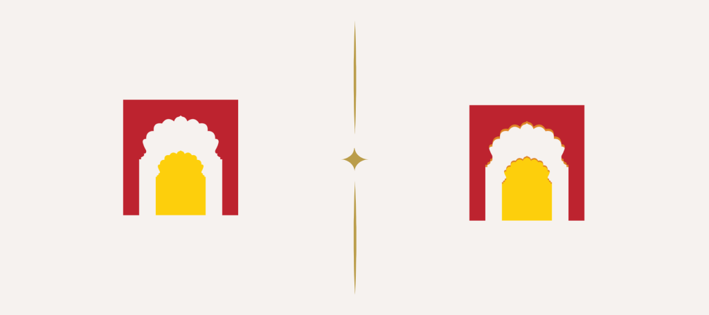
That decision influenced almost every aspect of the identity. The symbol had to remain instantly recognisable even when reproduced at just a few millimetres in size. It couldn’t rely on colour, intricate detailing or visual effects that might disappear during engraving. Every line, proportion and curve had to contribute to recognition rather than decoration, reinforcing our commitment to simplicity, symmetry and clarity.
It also led to another important refinement. The primary version of the logo features a subtle secondary-colour shadow that gently suggests the three-dimensional depth of a palace gateway. The effect is intentionally restrained—it adds character without distracting from the simplicity of the mark. However, we also knew that such fine details wouldn’t reproduce consistently across every medium. Laser engraving, embossing, foil stamping and certain printing techniques would either lose the shadow entirely or compromise the clarity of the symbol.
To solve this, we developed a second version of the logo that removed the subtle depth while preserving everything else. The flat version retains the exact same proportions, geometry and recognisable silhouette, ensuring that the identity remains visually consistent regardless of the production method. Most customers would never notice the difference, and that’s precisely the point. A flexible brand identity shouldn’t feel like multiple logos; it should adapt seamlessly to technical constraints while remaining unmistakably the same brand.
Instead of asking whether the logo looked luxurious on a presentation board, we kept returning to a more practical question throughout the project: Would someone still recognise this if it were engraved on the back of a pendant ten years from now?
That question became our benchmark for every design decision we made.
Creating a Bilingual Identity with a Single Personality
One of the project’s defining requirements was creating the identity in both English and Hindi. Although this might appear to be a straightforward translation exercise, multilingual branding is rarely that simple. Different scripts have distinct visual characteristics, and using unrelated typefaces can make a single brand appear as though it has two separate personalities.
Our objective was to create harmony rather than duplication.
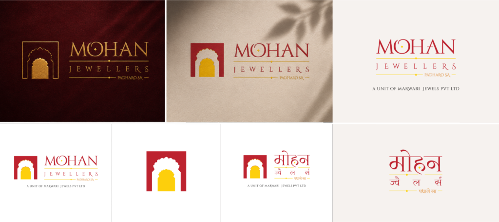
We carefully selected and refined open-source typefaces so that both versions shared the same visual rhythm, proportions and overall character. The English wordmark conveyed elegance and clarity, while the Hindi version retained its cultural familiarity without feeling disconnected from the primary identity. Neither version was treated as secondary. Instead, both became equal expressions of the same brand.
This consistency is particularly valuable for regional businesses serving multilingual audiences. A customer may first encounter the brand in English on social media and later visit a physical store where Hindi is more prominent. The transition should feel seamless. Recognition shouldn’t depend on language; it should depend on the identity itself.
By approaching typography with the same strategic thinking as the symbol, we ensured that every version of the logo reinforced the same promise of quality, heritage and trust.
A Colour Palette Inspired by Place, Not Convention
Luxury branding often follows familiar conventions. Black suggests sophistication. Gold implies prestige. White communicates elegance. While these combinations are timeless, they are also expected. Our objective was not simply to create another premium jewellery brand; it was to create one that belonged unmistakably to Marwar.
The colour palette therefore drew inspiration from the region itself.
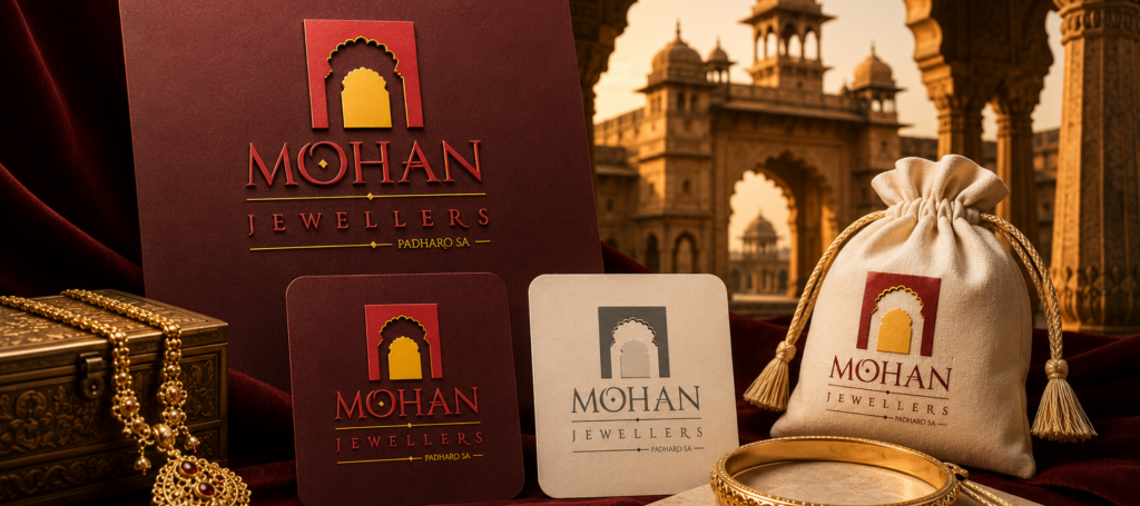
The rich maroon echoed the warmth of Rajasthan’s sandstone forts, royal architecture and traditional textiles. The earthy golden tones reflected the landscape, the desert and the welcoming warmth associated with Marwar’s cultural identity. Together, these colours created an atmosphere that felt authentic rather than manufactured.
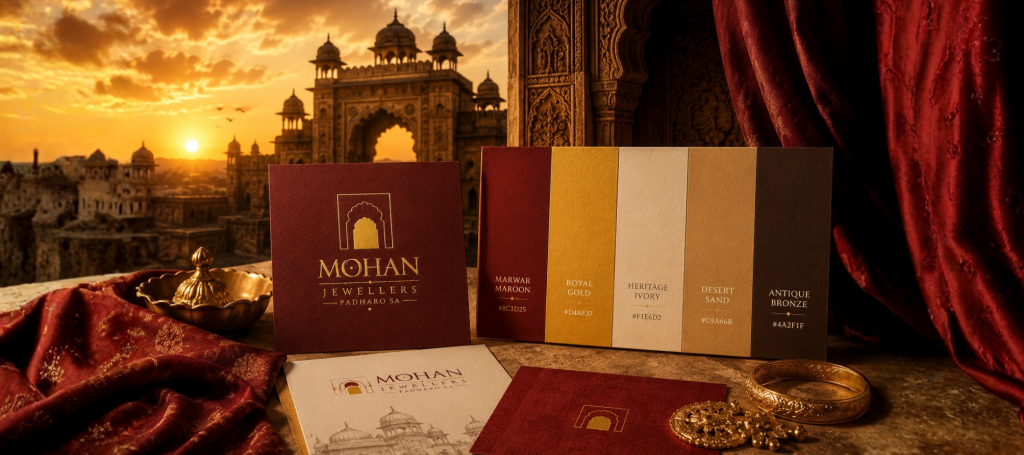
This decision also helped the brand distinguish itself within a highly competitive market. Instead of relying on generic luxury aesthetics, the colours reinforced the same narrative introduced by the symbol. Every visual element pointed back to the region that inspired the brand.
Strong branding is rarely built through isolated decisions. It emerges when colours, typography, symbols and messaging all support the same story.
Extending the Identity Beyond the Logo
One of the most satisfying moments in any branding project comes after the logo has been approved. Contrary to what many people believe, this isn’t the end of the creative process. It is the point where the identity begins to prove its versatility.
For Mohan Jewellers, we developed a range of brand collaterals including business cards, shopping bags and bill books. While these may appear to be standard deliverables, they offered an opportunity to demonstrate an important branding principle: a logo should not carry the entire burden of recognition.
As we explored different layouts, the palace gateway naturally evolved into a graphic device that could be used independently of the logo. On the business cards, for example, the arch became a framing element rather than a decorative background. This wasn’t something we had planned at the beginning of the project, but it emerged organically once the core identity had taken shape.
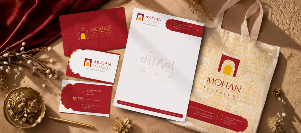
Looking back, it reinforced an important lesson. When the central idea behind a brand is strong enough, it often generates its own visual language. Instead of forcing additional graphics into the system, the identity itself begins to offer new possibilities.
This subtle distinction separates branding systems from isolated logo designs. A recognisable brand is built through repeated visual cues, thoughtful consistency and meaningful applications, not by placing the logo in every available corner.
The continued relationship with the client further validated this approach. As the brand grew, we were invited to design posters and promotional materials, allowing the visual language established during the branding phase to extend naturally into future communication.
The Value of Strategic Branding
Throughout my career, one conversation has repeated itself with remarkable consistency. A client approaches us asking for a logo, but after a deeper discussion, they realise that what they truly need is a brand strategy.
The distinction matters.
A logo can be designed in isolation. A brand identity cannot.
Every decision made during this project—from researching Marwar’s architecture to simplifying the symbol for engraving, pairing bilingual typography and developing a consistent visual system—was driven by business objectives rather than artistic preferences. None of these decisions were made simply because they looked attractive. They were made because they helped the brand communicate more effectively and prepare for future growth.
This is also why I often encourage clients to think about branding as a long-term investment rather than an upfront expense. A thoughtfully designed identity can serve a business consistently for ten years or more. Spread across that period, the annual cost becomes surprisingly small when compared to the value of stronger recognition, greater consistency and the confidence of knowing that the brand can support future expansion.
More importantly, a strong identity reduces the likelihood of expensive redesigns, fragmented communication and inconsistent customer experiences. The investment isn’t just in a logo; it’s in a foundation that every future marketing effort can build upon.
Designing for the Business You Aspire to Become
Looking back at the Mohan Jewellers project, the logo itself is perhaps the least interesting part of the story.
The real story lies in the decisions that shaped it.
It lies in choosing research before sketches. It lies in understanding a family’s heritage before selecting colours. It lies in recognising that a palace entrance could communicate trust more effectively than a diamond icon. It lies in preparing for applications the client hadn’t yet imagined and creating an identity capable of evolving alongside the business.
These are the decisions that rarely appear in a finished logo, yet they determine whether a brand continues to perform years after its launch.
At Fishyhue Studio, we believe branding should never be treated as a decorative exercise. Every project is an opportunity to understand a business more deeply, identify its unique strengths and translate those qualities into a visual identity that is memorable, practical and built to last.
For Mohan Jewellers, that identity was inspired by the timeless gateways of Marwar—symbols that have welcomed visitors for centuries. Much like those gateways, the brand now serves as an invitation: welcoming customers into a business rooted in heritage, guided by craftsmanship and prepared for the future.
Because the best branding doesn’t simply help a business look better.
It helps the right people remember it.