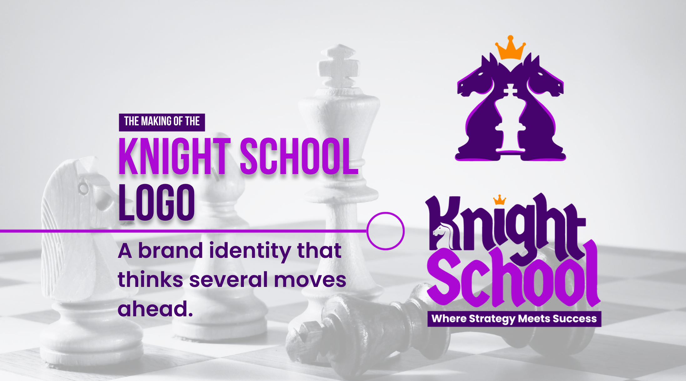
A behind-the-scenes look at how strategy, symbolism, typography, and color came together to create a brand built for long-term recognition.
A great logo doesn’t begin with sketches or software—it begins with understanding the business. Every successful brand has a story, a purpose, and a promise to its audience. Our role as branding consultants is to transform those ideas into a visual identity that people instantly recognize and remember.
For Knight School, the challenge wasn’t to design another chess logo. It was to create a brand identity that reflected strategic thinking, leadership, discipline, and growth while appealing to students, parents, and chess enthusiasts alike. This case study takes you behind the scenes of our branding process and shows how every design decision was driven by strategy rather than aesthetics alone.
Understanding the Brand Before Designing

Before opening Illustrator or drawing a single line, we focused on understanding the brand itself. Knight School is more than a coaching institute that teaches chess. It develops critical thinking, confidence, patience, and decision-making skills—qualities that extend well beyond the chessboard.
These insights shaped the creative direction. Instead of asking, “What should the logo look like?” we asked, “What should people feel when they see it?” That subtle shift in perspective changes the entire design process and often determines whether a logo becomes memorable or forgettable.
Building a Concept That Communicate
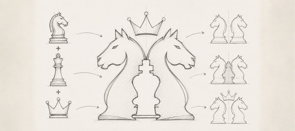
The strongest logos communicate multiple ideas through a single, uncomplicated symbol. We wanted the Knight School logo to reward closer observation without sacrificing simplicity.
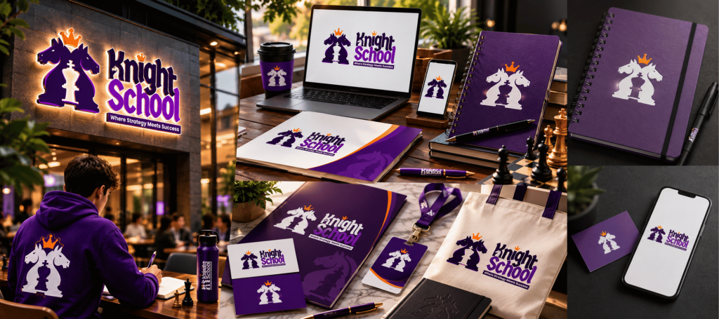
The final concept combines two mirrored knight chess pieces to represent intelligence, strategy, and mastery. Between them, the negative space subtly forms the silhouette of a king, symbolizing leadership and vision. A crown completes the composition, reinforcing excellence, achievement, and growth.
Rather than combining unrelated icons, every element was intentionally integrated into one cohesive mark. The result is a logo that appears simple at first glance but reveals greater meaning over time—one of the defining characteristics of successful brand identities.
Exploring Multiple Creative Directions
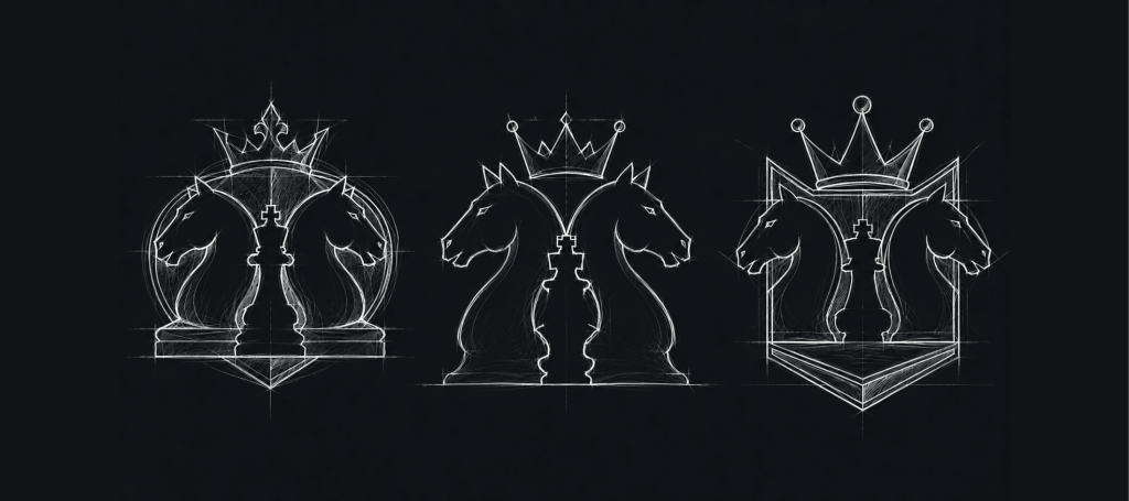
Professional branding is rarely a straight path. Every project begins with exploration, experimentation, and refinement before arriving at the strongest solution.
For Knight School, we developed several concepts that explored different combinations of knights, crowns, kings, and geometric forms. Each direction was evaluated for visual balance, scalability, uniqueness, and long-term relevance. Many promising ideas were discarded because they didn’t communicate the brand as effectively as the final concept.
This iterative process ensures the chosen identity isn’t simply attractive—it is strategically aligned with the business and capable of growing alongside it.
Typography That Reinforces the Brand
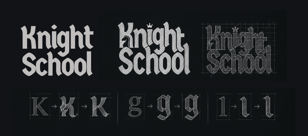
Typography is often underestimated, yet it plays a significant role in shaping a brand’s personality. For Knight School, we wanted lettering that felt authoritative and timeless while remaining distinctive.
The wordmark is built on a customized version of the open-source Germania One typeface. Inspired by traditional blackletter calligraphy, it communicates heritage, confidence, and craftsmanship. Through careful refinements and custom detailing, the typography became unique to the brand while preserving the elegance of the original style.
Its open-source SIL Open Font License (OFL) also makes it suitable for commercial branding, providing flexibility without restrictive licensing concerns.
Choosing Colours With Purpose
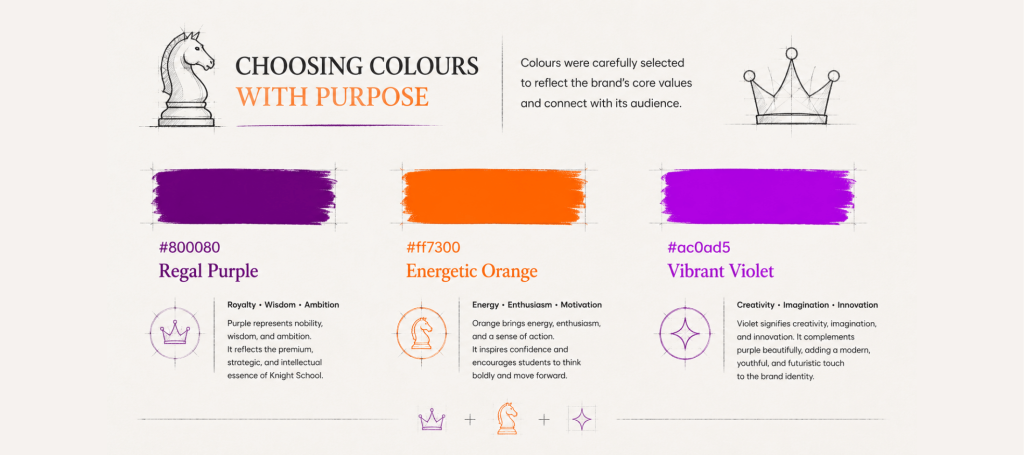
Colour is often the first emotional connection people make with a brand. Every shade influences perception, which is why colour selection should support the brand strategy rather than simply reflect personal preference.
For Knight School, we built a palette around three carefully chosen colours. Regal Purple (#800080) represents royalty, wisdom, and ambition, reinforcing the brand’s premium and intellectual positioning. Energetic Orange (#FF7300) introduces enthusiasm, motivation, and confidence, reflecting the energy required to learn, compete, and grow. Vibrant Violet (#AC0AD5) symbolizes creativity, imagination, and innovation, adding a modern edge that balances the brand’s traditional foundations. Together, these colours create a distinctive visual identity that communicates strategy, leadership, and forward thinking while remaining memorable and timeless.
Designing Beyond the Logo
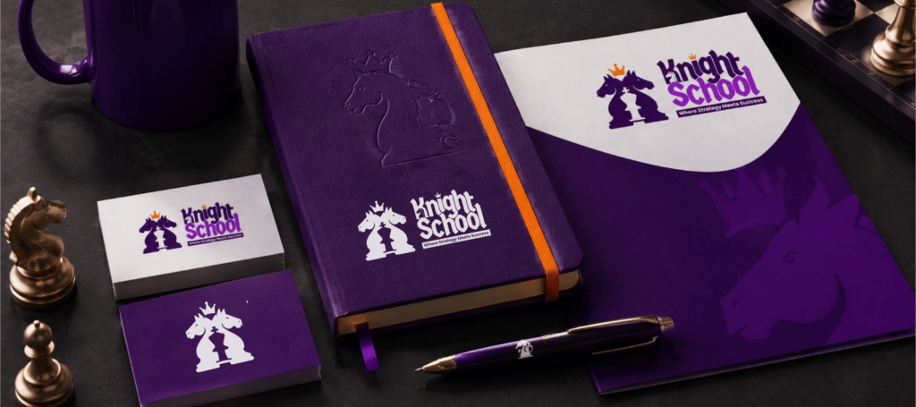
A successful logo should perform consistently across every touchpoint. During the branding process, we evaluated the identity in both digital and physical environments to ensure it remained impactful regardless of where it appeared.
From stationery and social media to merchandise, presentations, and promotional material, every application reinforced the same visual language. Testing the identity across different mediums ensures consistency, improves recognition, and strengthens the overall brand experience.
A logo may be the centerpiece of a brand, but the surrounding identity is what creates lasting recognition.
Why Strategic Branding Matters
Businesses investing in premium branding aren’t purchasing artwork—they’re investing in perception. A strategically designed identity builds credibility, creates differentiation, and communicates professionalism before a single conversation takes place.
This is why branding projects in the mid-premium to premium range focus on far more than the logo itself. They involve research, positioning, typography, colour psychology, visual systems, and practical applications that work together to create a cohesive brand.
When every design decision is intentional, marketing becomes more effective, customer trust grows, and the business develops a stronger competitive advantage.
Final Thoughts
The Knight School identity demonstrates that great branding is the result of thoughtful strategy rather than artistic instinct alone. Every sketch, colour choice, typographic refinement, and symbolic detail contributes to a larger story—one that reflects the brand’s values and resonates with its audience.
At Fishyhue Studio®, we believe a logo should do more than look impressive. It should communicate purpose, inspire confidence, and become a lasting asset that supports business growth for years to come.
Like what you see?
Every successful logo begins with a clear strategy, not just creativity. If you’re ready to build a brand that communicates trust, personality, and long-term value, we’d love to help.
Transparency Note: Some presentation mockups and supporting visuals in this case study were created or enhanced with AI-assisted tools. The branding strategy, creative direction, logo design, typography, colour selection, and final brand identity are original work by Fishyhue Studio®.